digital
Website design for the visual artist,
teacher and researcher Daniel Jablonski
August, 2021
Website design for the visual artist,
teacher and researcher Daniel Jablonski
August, 2021
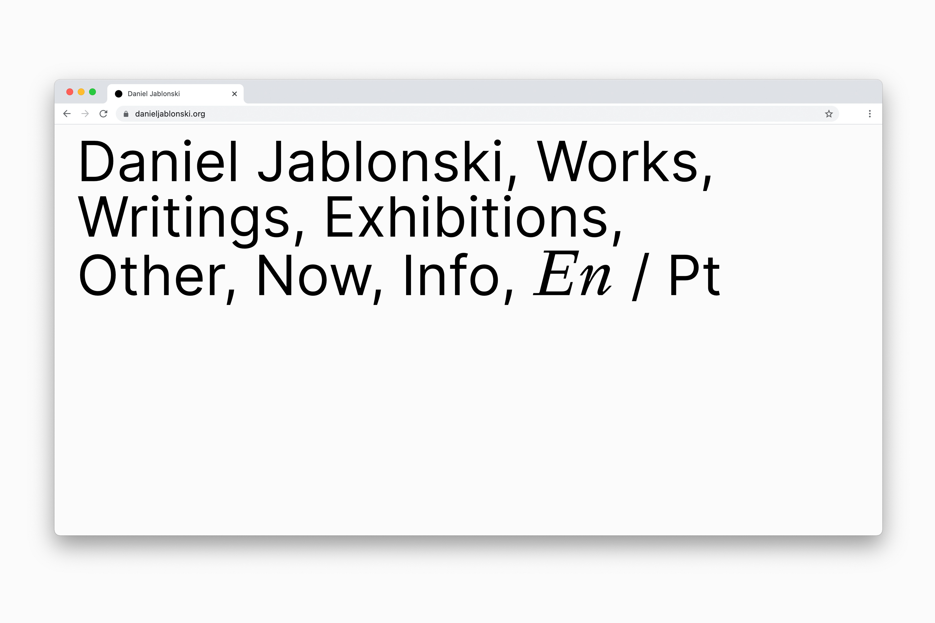
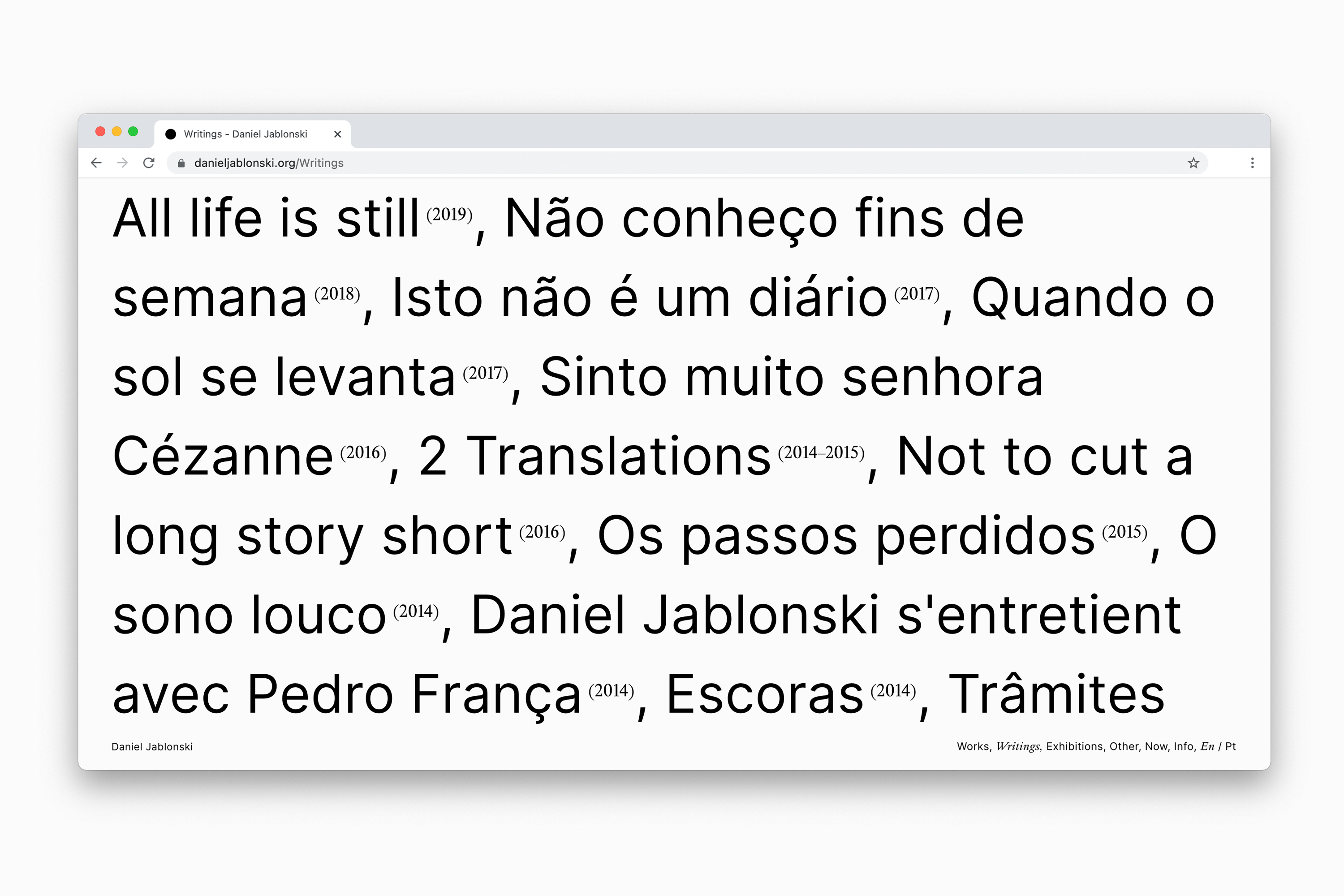
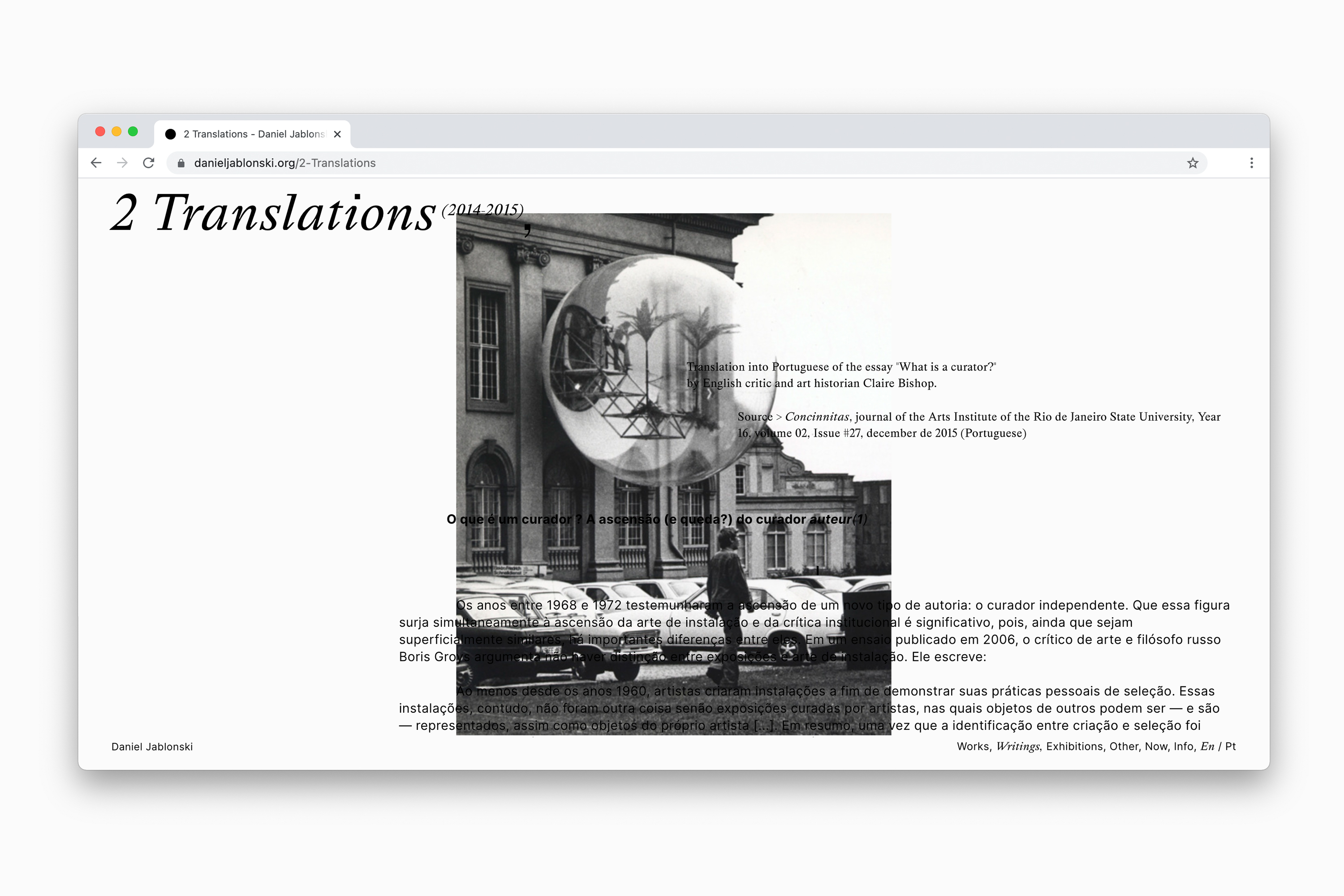
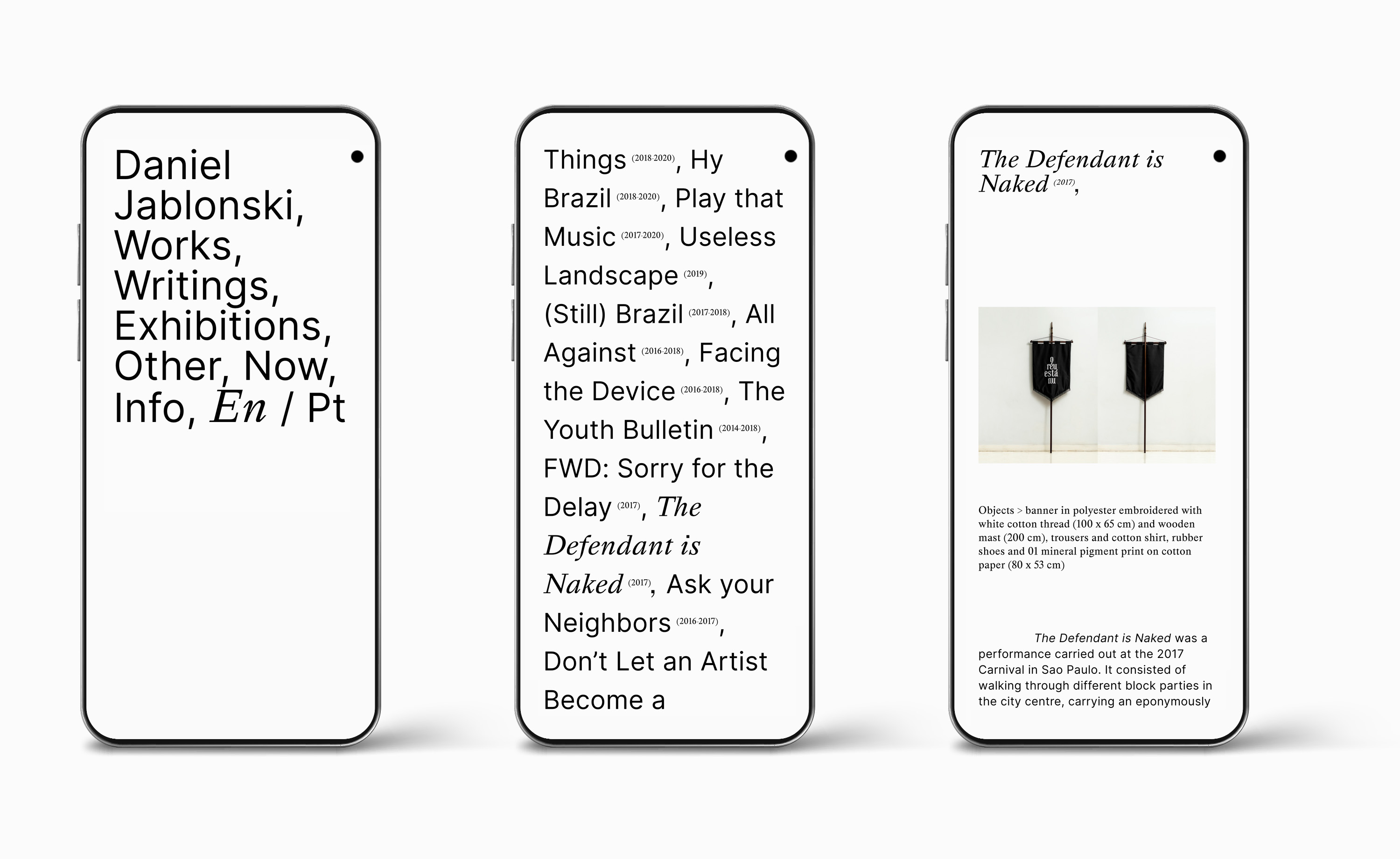
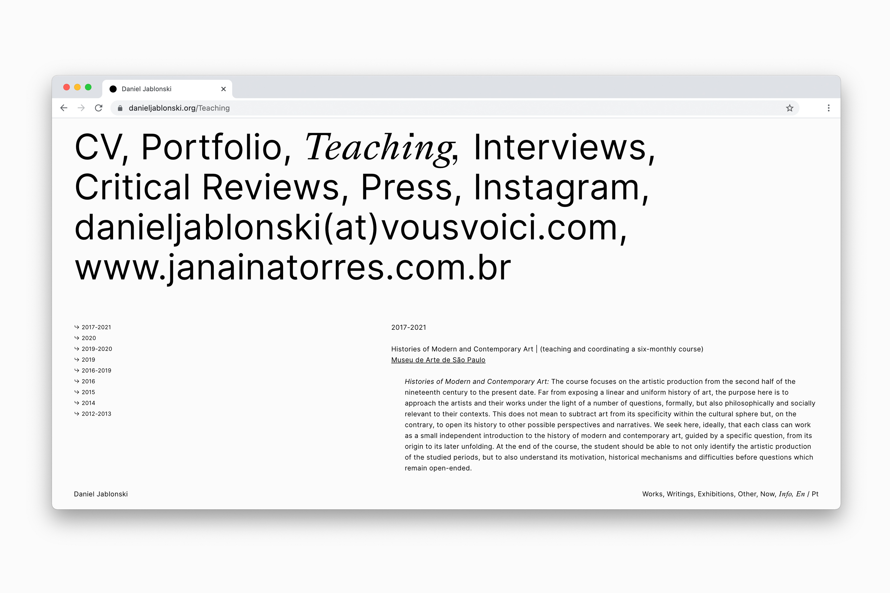
Invited by Daniel Jablonski, Estúdio Membrana designed his new bilingual website, combining visual works, exhibition records, as well as essays, translations and other writings by the artist.
Identifying the title of the works (and the language, in general) as a relevant and recurring element throughout his production, the research intended to construct an environment in which the texts and images of Jablonski’s works could be visualized in layers. Thus, two typographic fonts were selected to point out that the titles work as links, without, however, losing sight of the importance of the adequate visualization of the images, presented in large format. Based on this concept, we proposed a layout and navigation model, organized the texts and edited the image flows in their respective categories. These contents were placed in an environment designed to expose, in a simple and direct way, the multifaceted production of Jablonski as a visual artist, teacher and researcher.
The typographic fonts chosen for the website are: Happy Times at the IKOB, by Lucas Le Bihan, a contemporary version of Times New Roman, and Inter, by Rasmus Andersson, a family of variable fonts designed for computer screens.
danieljablonski.org


digital
Edições Membrana’s visual identity
and exhibitor website design for
Printed Matter's Virtual Art Book Fair, NY
February, 2021
Edições Membrana’s visual identity
and exhibitor website design for
Printed Matter's Virtual Art Book Fair, NY
February, 2021
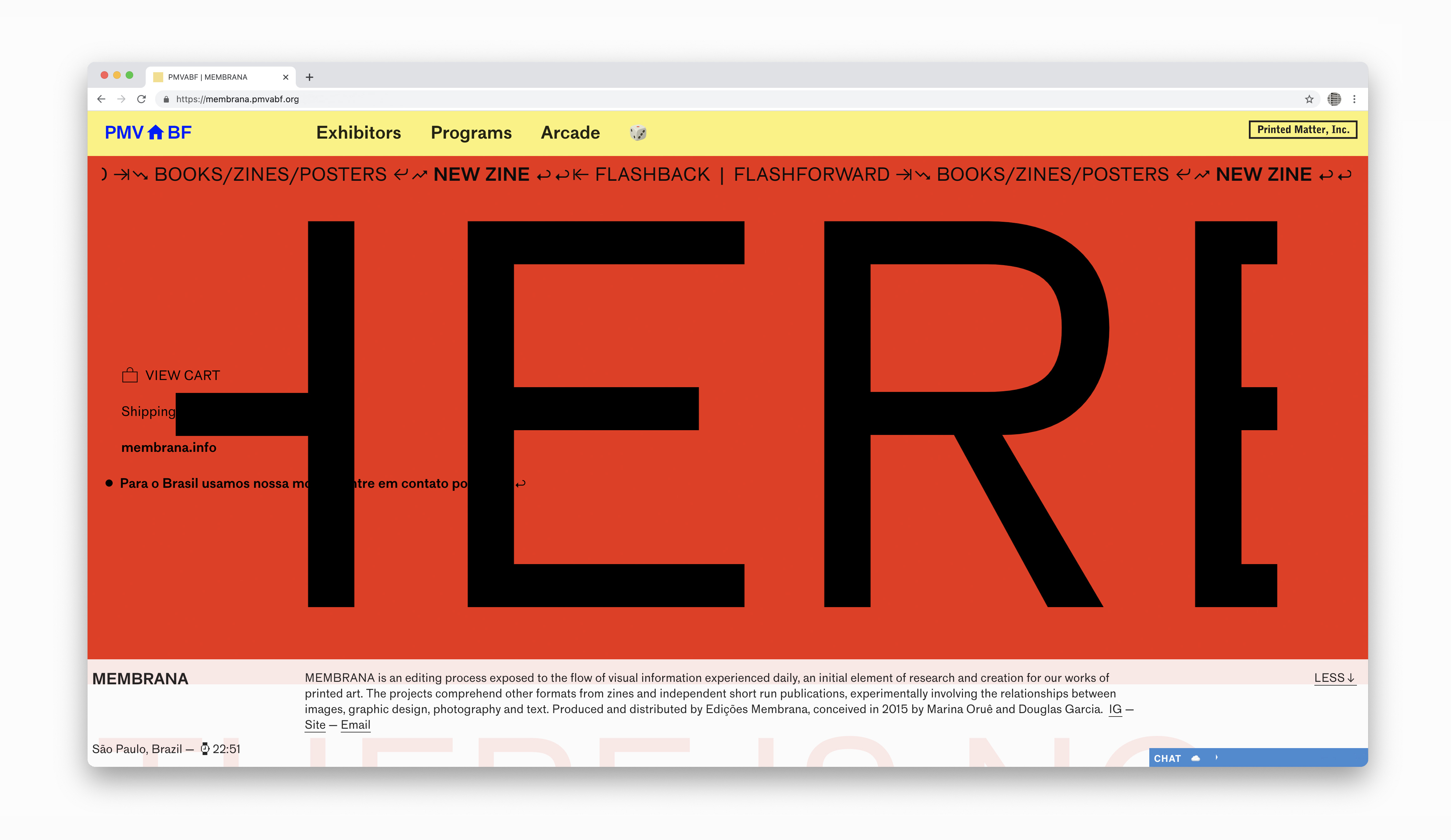
Estúdio Membrana designed exclusively for the web platform of Printed Matter’s Virtual Art Book Fair (PMVABF) the Edições Membrana’s exhibitor website, gathering publications, posters and videos.
During the five days of fair, each exhibitor presented a personalized website dedicated to his or her projects. On these websites, visitors could find artists’ books for purchase, video arts, lectures, songs, as well as the opportunity to interact with exhibitors.
The first online edition of Printed Matter's Virtual Art Book Fair, NY, featured more than 400 exhibiting artists, collectives, publishers and institutions from 43 countries in an innovative and widely accessible experience for exhibitors and visitors from all over the world.
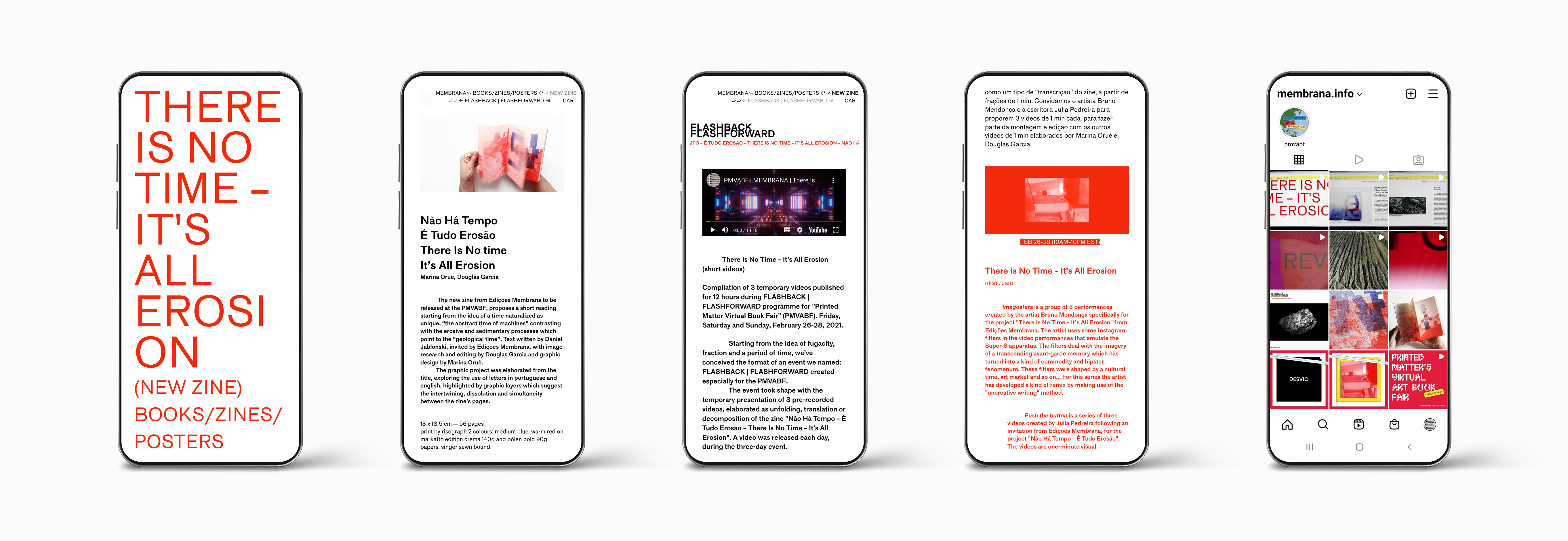
For the visual identity of Edições Membrana's home, we decided to use maximized typography, exploring a different way of reading the title of the publication There Is No time – It’s All Erosion, emphasizing its launch during the virtual fair.
The catalog of publications and posters was organized in an e-commerce layout. Also, the page of the event Flashback | Flashforward was created to show the temporary videos of Edições Membrana created specially for PMVABF in February 2021.
During the five days of fair, each exhibitor presented a personalized website dedicated to his or her projects. On these websites, visitors could find artists’ books for purchase, video arts, lectures, songs, as well as the opportunity to interact with exhibitors.
The first online edition of Printed Matter's Virtual Art Book Fair, NY, featured more than 400 exhibiting artists, collectives, publishers and institutions from 43 countries in an innovative and widely accessible experience for exhibitors and visitors from all over the world.
For the visual identity of Edições Membrana's home, we decided to use maximized typography, exploring a different way of reading the title of the publication There Is No time – It’s All Erosion, emphasizing its launch during the virtual fair.
The catalog of publications and posters was organized in an e-commerce layout. Also, the page of the event Flashback | Flashforward was created to show the temporary videos of Edições Membrana created specially for PMVABF in February 2021.
pmvabf.org/Exhibitors